
Buttonはユーザーに処理(アクション)をさせるために使用する要素です。選択すると、対応するビジネスロジックが作動します。
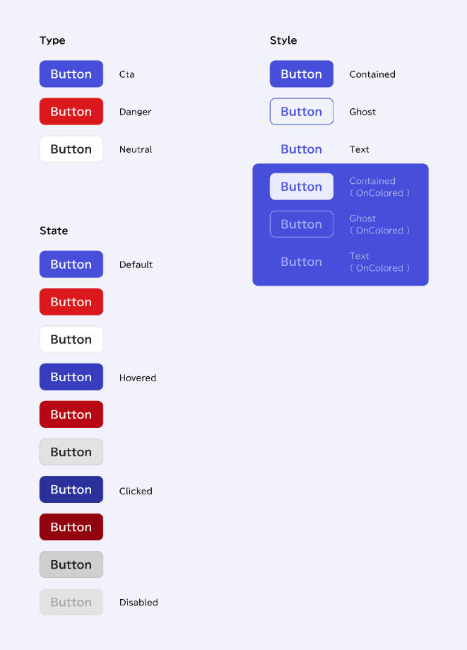
FDSでは以下の3タイプのボタンを用意しています。
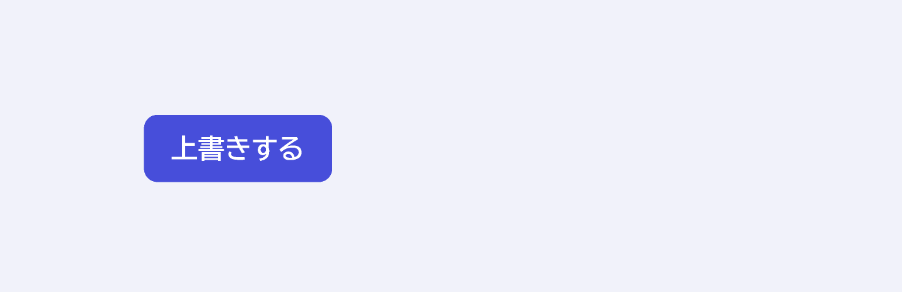
Contained
メインアクションに使用します。1つのセクションに最大で1つのContained Buttonを配置できます。
Ghost
キャンセル、あるいは優先度の低いアクションに使用します。
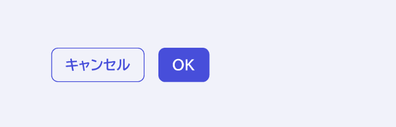
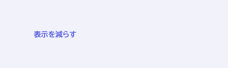
Text
最も二次的なアクションに使用します。
Usage
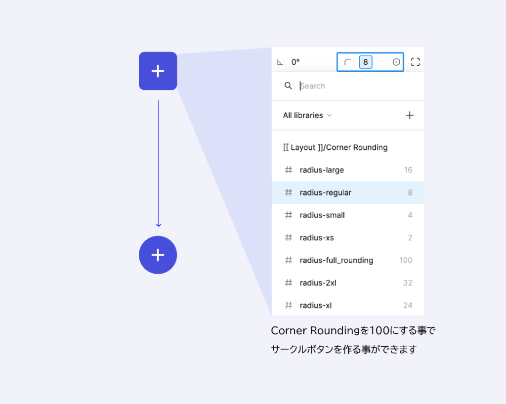
Corner Roundingのサイズを変える事で、直角からフルラウンディングまで色々なスタイルのボタンにする事ができます。
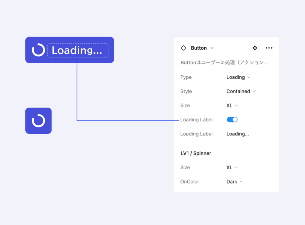
LoadingタイプはプロパティでLoading Labelを非表示にする事でSpinnerのみ表示させる事もできます。
Properties(振る舞いの設定)
Component Propertiesで設定されている内容。

Variables(色の設定)
カラートークン(Contained)
| Style | Element | Token |
| Cta | Label | General/Neutral/static white |
| Icon | General/Neutral/static white | |
| Container:Default | General/Primary/main | |
| Container:Hovered | General/Primary/hovered | |
| Container:Selected | General/Primary/selected | |
| Danger | Label | General/Neutral/static white |
| Icon | General/Neutral/static white | |
| Container:Default | General/Danger/main | |
| Container:Hovered | General/Danger/hovered | |
| Container:Selected | General/Danger/selected | |
| Neutral | Label | General/Neutral/main |
| Icon | General/Neutral/main | |
| Container:Default | General/Neutral/contrast | |
| Container:Hovered | General/Neutral/hovered fade | |
| Container:Selected | General/Neutral/selected fade | |
| Disabled | Label | General/Neutral/disabled |
| Icon | General/Neutral/disabled | |
| Container | General/Neutral/disabled background |