
ユーザーが複数のオプションから複数の項目を選択するためのUIです。
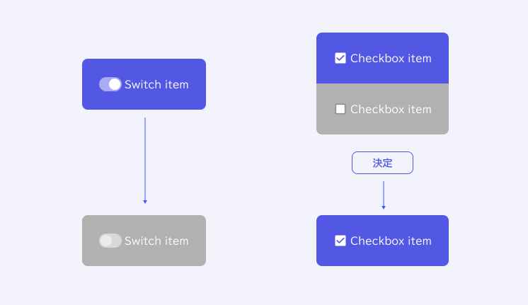
チェックボックスを1つだけ使用する場合は、Switchを使って2つの状態を切り替える事と同じですが、以下の違いがあります。
- Switch=状態を直接変更できる
- Checkbox=マークするだけのUIで、状態の変更には別途送信アクションが必要
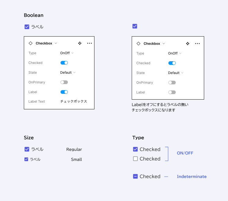
Properties (振る舞いの設定)
Component Propertiesで設定されている内容。
Variables (色の設定)
各ステート時の配色はこちらを参考にしてください。
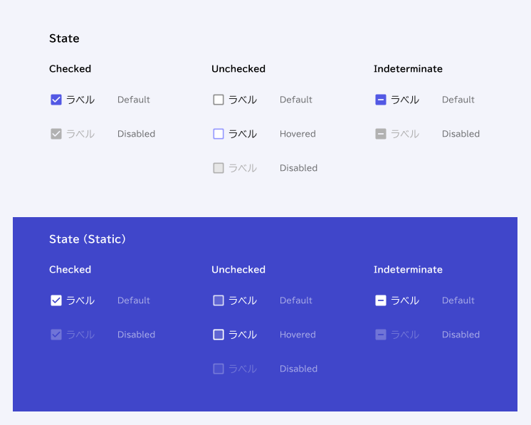
State
| Style | Element | Token |
| Label | General/Neutral/main | |
| Label:disabled | General/Neutral/disabled | |
| Checked | check_box | General/Primary/main |
| check_box:disabled | General/Neutral/disabled | |
| Unchecked | check_box:outline | General/Neutral/subtle |
| check_box:outline-hover | General/Primary/accent | |
| check_box:background | General/Neutral/contrast | |
| check_box:disabled-outline | General/Neutral/disabled | |
| check_box:disabled | General/Neutral/disabled background | |
| Indeterminate | indeterminate | General/Primary/main |
| indeterminate:disabled | General/Neutral/disabled |
State (Static)
| Style | Element | Token |
| Label | General/Neutral/static white | |
| Label:disabled | General/Neutral/contrast opacitiy25 | |
| Checked | check_box | General/Neutral/static white |
| check_box:disabled | General/Neutral/contrast opacitiy25 | |
| Unchecked | check_box:outline | General/Neutral/contrast opacitiy80 |
| check_box:outline-hover | General/Neutral/static white | |
| check_box:background | General/Neutral/contrast | |
| check_box:disabled-outline | General/Neutral/contrast opacitiy16 | |
| check_box:disabled | General/Neutral/contrast opacitiy25 | |
| Indeterminate | indeterminate | General/Neutral/static white |
| indeterminate:disabled | General/Neutral/contrast opacitiy25 |