
Pagenationは、大量のコンテンツやデータを複数のページに分割し、次のページや前のページに移動するためのコントロールとして使用します。
種類
Paginationは、以下3種類を利用可能です。
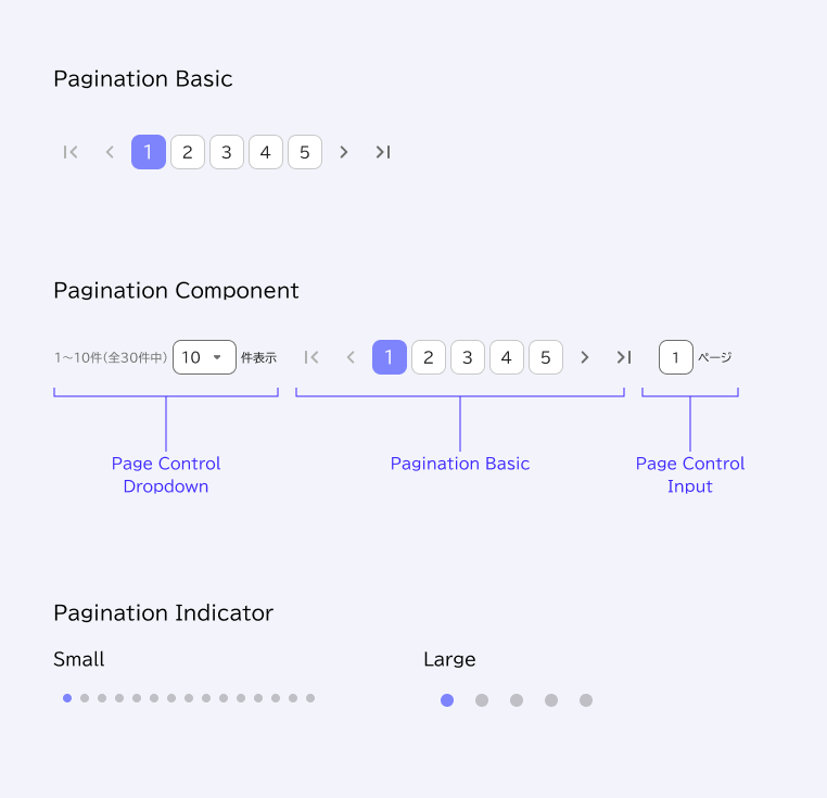
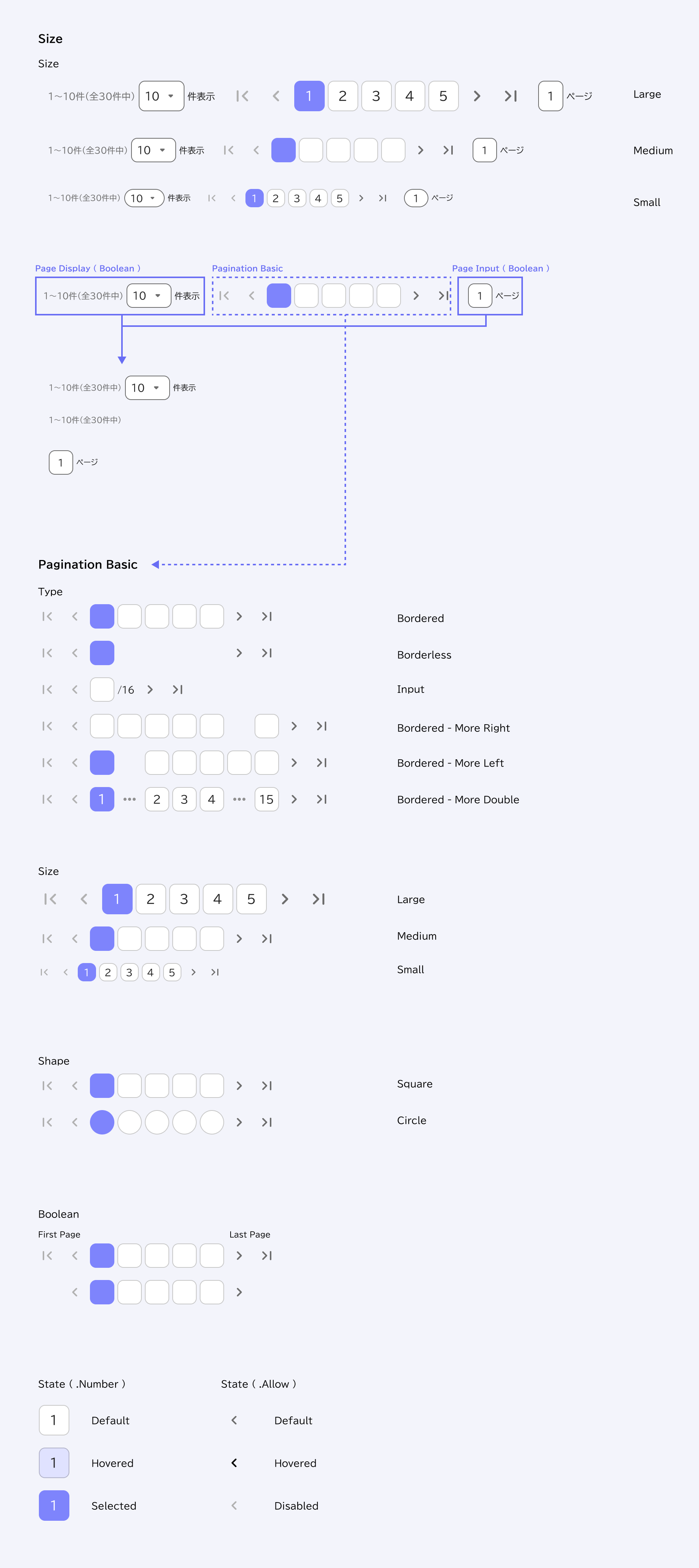
- Pagination Basic:Paginationの基本機能のみ
- Pagination Component:表示件数の指定、表示ページの入力機能を備えています
- Pagination Indicator:ページ数を簡易的にドットで表しています
Properties(振る舞いの設定)
Component Propertiesで設定されている内容。
カラートークン
| State | Element | Token |
| Default | Label(Number) | General/Neutral/main |
| Container | General/Neutral/contrast | |
| Icon(Allow) | General/Neutral/light | |
| Hovered | Label(Number) | General/Neutral/main |
| Container | General/Primary/hovered fade | |
| Icon(Allow) | General/Neutral/hovered | |
| Selected | Label(Number) | General/Neutral/static white |
| Container | General/Primary/light | |
| Disabled | Icon(Allow) | General/Neutral/disabled |
Usage
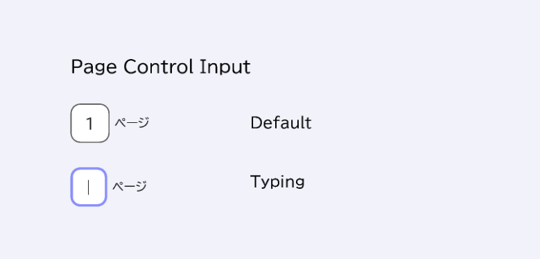
Page Control Inputは、ユーザーが直接値を入力する事ができます。
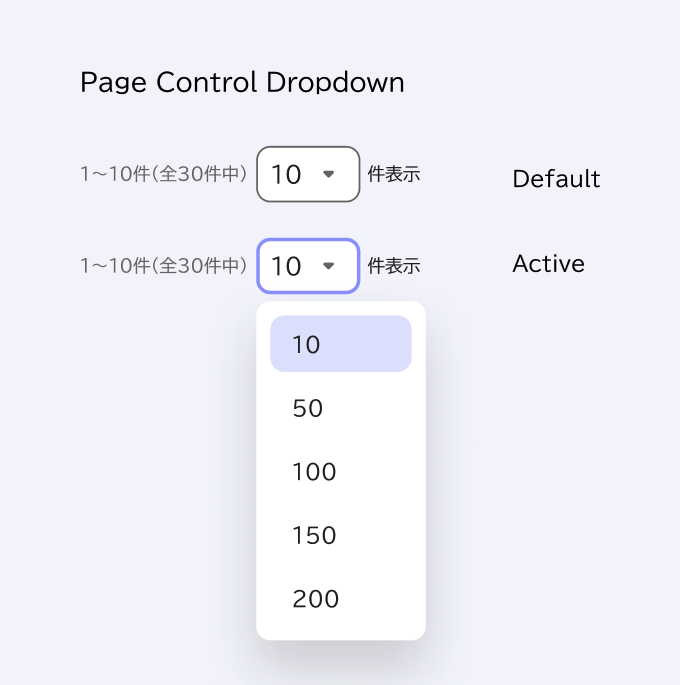
Page Control Dropdownでは、ユーザーが表示件数を選ぶ事ができます。Popup Menuと併せて使用します。